The Ultimate Guide to Ecommerce Banner Design Best Practices

Your ecommerce banners aren’t just decorative elements scattered across your online store, they’re your frontline sales team, working 24/7 to capture attention, spark interest, and drive action. Think of them as the digital equivalent of a compelling shop window on the busiest street in town.
The challenge? Today’s consumers are bombarded with visual information. Studies show the average person encounters over 5,000 ads daily, and most are filtered out before they even register consciously. This phenomenon, known as “banner blindness,” means your banner has roughly three seconds to communicate its value proposition before a potential customer scrolls past.
Effective ecommerce banner design best practices go far beyond choosing pretty colors and slapping on your logo. They require understanding visual hierarchy, consumer psychology, and the delicate balance between aesthetics and conversion optimization. This guide will walk you through proven strategies that transform passive banners into active revenue generators.
Core Components of a High-Converting Ecommerce Banner
Every successful ecommerce banner contains five essential elements that work together to drive conversions. Missing even one can significantly impact your results.
1. Product Title
Your product title should be short, actionable, and immediately communicate value. Rather than generic phrases, use power words that inspire action: “Discover,” “Unlock,” “Transform,” or “Experience.” For example, instead of “New Shoes Collection,” try “Discover Your Perfect Fit.”
2. Product Description
Keep your description brief – no more than one or two sentences. Focus relentlessly on benefits rather than features. Your customer doesn’t care that your jacket has “three-layer Gore-Tex construction”; they care that they’ll “stay dry and comfortable in any weather.”
3. Hero Image
High-resolution images are non-negotiable in ecommerce banner design best practices. Your hero image should feature a single focal point – one product, clearly displayed, without distracting elements. Avoid over-filtering or heavy editing that makes products look unrealistic. Authenticity builds trust, and trust drives conversions.
4. Prominent Call-to-Action (CTA)
Your CTA button should be impossible to miss and easy to tap on mobile devices (remember, 65% of consumers prefer shopping on mobile). Use contrasting colors, adequate white space, and direct language. More on innovative CTA strategies later.
5. Special Offer or Price
If you’re running a promotion, make it crystal clear. Display the discount percentage prominently, show before-and-after pricing, and consider adding urgency indicators like “24 Hours Only” or “While Supplies Last.” Price clarity eliminates friction in the buying process.
Design Best Practices for Higher Conversions
Understanding ecommerce banner design best practices means knowing both what to embrace and what to avoid. Let’s break down the critical design principles that separate high-performing banners from those that get ignored.
Layout and Composition
You have three seconds – maybe less – to deliver your banner’s message. If a viewer can’t instantly understand what you’re offering and why they should care, they’ll move on. This means every element must serve a purpose.
Visual hierarchy is your most powerful tool. Your promotional details should dominate the visual space, while logos and legal disclaimers stay in the background. The human eye naturally follows a Z-pattern when scanning content, so place your most important information along this path: top-left (entry point), top-right (secondary information), bottom-left (supporting details), and bottom-right (CTA).
Minimalism isn’t just a design trend – it’s a conversion optimization strategy. Research consistently shows that reducing visual clutter increases comprehension and action rates. Remove any element that doesn’t directly contribute to your conversion goal.
Image Guidelines
Single product focus is crucial. Studies comparing cluttered product collages versus single-item displays show conversion rate increases of up to 40% with focused imagery. Your banner should showcase one hero product or one cohesive product set, not your entire catalog.
Avoid overlapping elements at all costs. When logos, text, or other elements overlap your hero image, they create visual confusion and reduce the impact of both elements. Instead, place your logo in the upper-left corner – the natural starting point for reading patterns and keep text in clearly defined areas that don’t compete with your product imagery.
Mobile optimization requires extra attention here. What looks clean on desktop can become cluttered chaos on mobile. Always preview your designs on multiple screen sizes and ensure text remains readable without zooming.
Typography and Color
The two-font rule exists for good reason. Using more than two fonts creates visual discord and makes your banner look amateurish. Choose one font for headlines and another for body text, ensuring both are easily readable at various sizes.
Color harmony isn’t about following trends, it’s about ensuring visibility and brand consistency. Your color choices should create adequate contrast for readability while maintaining your brand identity. Use complementary colors strategically to guide the eye toward your CTA and key information.
Strategic Placement and Banner Types
Where you place your banners matters as much as how you design them. Understanding the different banner types and their optimal use cases is fundamental to ecommerce banner design best practices.
Static vs. Dynamic
Static banners work well for consistent messaging and branding. They load quickly, work on any device, and don’t distract from browsing. Use them for evergreen promotions or brand awareness campaigns.
Dynamic or rotating banners can showcase multiple offers without taking up more screen real estate. However, use them carefully – auto-rotating banners can trigger banner blindness if they move too quickly or disrupt the user experience. If you choose dynamic banners, ensure each slide displays for at least 5-7 seconds and include navigation dots so users can control the experience.
The Power of Search Result Banners
Here’s a value-add insight that most guides overlook: users engaging with your on-site search are 216% more likely to convert than average visitors. These are highly motivated shoppers who know what they want. Placing targeted banners on search results pages lets you capture this high-intent traffic with relevant offers.
For example, if someone searches for “running shoes,” display a banner promoting your running shoe sale or highlighting your best-reviewed running footwear. This contextual relevance dramatically increases conversion rates.
Mobile-First Design
With 65% of consumers preferring mobile shopping, mobile-first design isn’t optional, it’s essential. This means designing for mobile screens first, then scaling up for desktop, not the other way around.
Mobile-optimized banners require larger tap targets (minimum 44×44 pixels), simplified layouts, and faster load times. Test your banners on actual mobile devices, not just desktop browser simulators, to catch issues with readability and functionality.
Conversion Psychology & Personalization Strategies
Once you’ve mastered the basics of ecommerce banner design best practices, these advanced strategies can take your conversion rates to the next level.
Psychological Triggers That Drive Action
Scarcity and urgency are powerful motivators. Phrases like “Last Chance,” “Only 3 Left,” or “Limited Time Offer” tap into fear of missing out (FOMO), a fundamental human driver. However, use these tactics ethically – false scarcity damages trust and brand reputation.
Social proof builds credibility instantly. Integrating reviews, ratings, or testimonial snippets directly into your banner design leverages the psychological principle that people follow the actions of others. A banner stating “Join 50,000+ Happy Customers” or displaying a 4.8-star rating can significantly boost click-through rates.
The Personalization Powerhouse
Here’s a game-changing statistic: 80% of users are more likely to purchase when the experience is personalized to their needs and preferences. Generic, one-size-fits-all banners are leaving money on the table.
Modern ecommerce platforms allow you to leverage first-party data – browsing history, purchase behavior, cart contents to create dynamic, personalized banner experiences. Show returning customers products related to their previous purchases. Display location-specific promotions. Highlight items they’ve viewed but not purchased.
This transition from generic banners to one-to-one personalization represents the future of ecommerce banner design best practices. Start simple by segmenting your audience into a few key groups, then progressively refine your approach based on performance data.
CTA Copy Innovation
Traditional “Buy Now” or “Shop Now” buttons work, but innovative CTA copy can perform significantly better by creating a sense of ownership and personal connection. First-person phrases like “I Am Ready,” “Get My Discount,” or “I Want To Save” increase resonance because they position the action from the customer’s perspective.
This subtle psychological shift makes the action feel like the customer’s decision rather than your request. Test variations to see which resonates with your specific audience – the results might surprise you.
Measuring Success Beyond the Click
Implementing ecommerce banner design best practices without proper measurement is like driving blindfolded. You need clear KPIs to understand what’s working and what needs adjustment.
KPIs That Actually Matter
Click-through rate (CTR) measures engagement, but it doesn’t always correlate with revenue. A banner with a 5% CTR that sends traffic to a poorly aligned landing page will underperform one with a 2% CTR that targets the right audience with the right offer.
Conversion rate is where rubber meets road. What percentage of users who click your banner actually complete a purchase? This metric reveals whether your banner messaging aligns with customer expectations and landing page experience.
Bounce rate indicates misalignment. If users click your banner but immediately leave the landing page, your banner messaging doesn’t match what they find. This wastes ad spend and frustrates potential customers.
Return on investment (ROI) is the ultimate measure. Compare the cost of creating and displaying your banner against the revenue it generates. A beautiful banner that doesn’t drive profitable sales is just expensive art.
A/B Testing Framework
Effective A/B testing requires discipline. Test only one variable at a time – CTA color, headline copy, image choice, so you can definitively attribute performance changes to specific elements.
Ensure statistical significance by running tests with adequate sample sizes and duration. A test that shows a 10% improvement after 50 clicks means nothing. Wait for at least 1,000 visitors per variation and run tests for complete business cycles (including weekdays and weekends) before drawing conclusions.
Document everything. Create a testing log that records what you tested, when, and what you learned. This builds institutional knowledge and prevents repeatedly testing the same elements.
Taking Your Banner Strategy to the Next Level
Mastering ecommerce banner design best practices is an ongoing journey, not a destination. Consumer preferences evolve, technologies improve, and your competitors are constantly iterating. The most successful ecommerce stores treat banner optimization as a continuous process of testing, learning, and refining.
Start with the fundamentals covered in this guide: clear visual hierarchy, mobile-first design, strategic placement, and psychological triggers. Then layer in personalization and advanced tactics as your capabilities grow.
Remember the shop window analogy: you wouldn’t cram every product you sell into a single display, and you wouldn’t keep the same window design for years. Apply this same strategic thinking to your digital banners, and you’ll see your conversion rates climb.
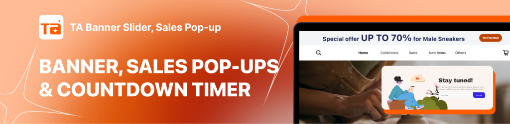
Ready to transform your static banners into dynamic conversion engines? Whether you’re looking to create seamless storytelling with a banner slider or capture abandoning visitors with a high-converting sales pop-up, the right tools combined with these proven design principles will help you maximize every visitor’s potential.
The question isn’t whether you can afford to optimize your banner strategy, it’s whether you can afford not to.

Hi, I’m Vu Cam Chi – a detail-driven digital marketer focused on building practical growth solutions for ecommerce and digital products. I combine data, user behavior, and clear messaging to turn ideas into results. Strategy guides my decisions, and optimization is part of my daily work. I care deeply about creating experiences that make sense for users and actually perform.