Best Website Popup Examples to Boost Conversions

Are popups annoying? Maybe. Do they work? Absolutely.
Despite their sometimes controversial reputation, website popups remain one of the most effective tools for capturing leads, reducing cart abandonment, and boosting sales. The key difference between an annoying popup and a high-converting one lies in the strategy behind it – they may be the timing, the offer, the design, and the value it provides.
The average popup conversion rate across industries sits at 3.1%, but top-performing popups consistently achieve conversion rates of 9.3% or higher, with exceptional campaigns reaching 40% or more. Current data shows that the average ecommerce popup conversion rate has risen to 4.65% in 2025, with mobile popups performing 38% better than their desktop counterparts.
In this comprehensive guide, we’ll explore the essential types of popup examples and showcase real store examples that are driving measurable results. Whether you’re looking to grow your email list, recover abandoned carts, or promote a flash sale, these popup examples will inspire your next campaign.
Types of Popup Examples
Understanding different popup formats and trigger mechanisms is crucial for matching the right tool to your specific conversion goal. Here are the 8 essential types of popups every marketer should know.
1. Modal Popups
The traditional center-screen popup that dims the background, modal popups command full attention by overlaying content and requiring user interaction before continuing. They work best for high-value offers that warrant interrupting the browsing experience, such as significant discounts, exclusive access, or important announcements.
Best for: First-time visitor discounts, major announcements, exclusive offers
Average conversion rate: 3-5%
When to use: Landing pages, homepage visits, high-intent product pages
Tip: Use sparingly to avoid frustrating visitors – limit to once per session
2. Exit-Intent Popups
These popups trigger when a visitor’s cursor moves toward the browser’s close button or back button, indicating they’re about to leave. Exit-intent popup technology detects abandonment behavior and presents a last-chance offer to save the visitor. They’re ideal for recovering abandoning visitors through discounts, content offers, or feedback requests.
Best for: Cart recovery, lead capture, gathering exit feedback
Average conversion rate: 2-4% (but saves otherwise lost visitors)
When to use: Product pages, cart pages, blog articles
Tip: Don’t interrupt engaged browsing, only appear when visitors have decided to leave
3. Floating Bars / Sticky Bars
Persistent bars that remain fixed at the top or bottom of the screen as visitors scroll, floating bars are the least intrusive popup format. They maintain visibility without blocking content, making them perfect for ongoing promotions that shouldn’t interrupt the browsing experience.
Best for: Free shipping thresholds, ongoing promotions, announcements
Average conversion rate: 1-3%
When to use: Site-wide persistent messaging
Tip: Keep copy brief (under 10 words) and include a clear call-to-action
4. Slide-In Popups
Gently sliding from the bottom corner of the screen, slide-in popups offer a middle ground between persistent bars and center-screen modals. Their subtle entrance creates less disruption than modal popups while still capturing attention effectively.
Best for: Newsletter signups, related content suggestions, secondary offers
Average conversion rate: 2-4%
When to use: Blog content, mid-funnel pages
Tip: Trigger after 50% scroll depth to ensure engagement before display
5. Fullscreen Overlays / Welcome Mats
High-impact “takeovers” that cover the entire screen, fullscreen overlays command maximum attention by temporarily blocking all other content. Their commanding presence ensures your message is seen, making them ideal for critical information or high-value offers.
Best for: Age verification, major announcements, first-time visitor offers
Average conversion rate: 5-10%
When to use: Homepage landing, gated content, compliance requirements
Tip: Overuse quickly leads to frustration—reserve for genuinely important messages
6. Scroll-Triggered Popups
These popups appear after a visitor scrolls a specific percentage (typically 50-70%) down a page, indicating genuine engagement with your content. The scroll trigger ensures visitors have absorbed some value before being asked for action.
Best for: Content upgrades, related resources, newsletter signups
Average conversion rate: 4-6%
When to use: Blog posts, long-form content, educational pages
Tip: Match the popup offer to the content topic for maximum relevance
7. Gamified Popups
“Spin-to-win” wheels and other interactive formats transform popup engagement into entertainment. These playful formats create positive associations with your brand while collecting email addresses and offering various prizes or discounts.
Best for: First-time visitor engagement, email list building, brand awareness
Average conversion rate: 10-17%
When to use: E-commerce homepages, seasonal campaigns
Example: Émoi émoi achieved a 17% signup rate using a spin-wheel popup
Tip: Ensure every outcome offers value to maintain trust
8. Video Popups
“Showstoppers” that play product demonstrations, tutorials, or promotional content automatically or on-click. Video popups work exceptionally well for complex products that benefit from visual explanation or emotional storytelling.
Best for: Product education, testimonial showcases, brand storytelling
Average conversion rate: 3-8%
When to use: Product pages, service offerings, B2B landing pages
Tip: Always include captions and keep videos under 60 seconds for maximum engagement
Store Examples of High-Converting Popups
Now let’s explore real store examples organized by their conversion goals. Each example demonstrates proven strategies that you can adapt for your own business.
Blume – First-Order Discount Modal
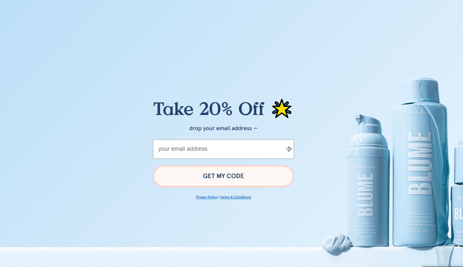
Blume’s welcome popup achieves a 5% conversion rate by offering new visitors a discount on their first purchase in exchange for an email address. The design is clean with a soft color palette, the value proposition is crystal clear (“Get 10% Off Your First Order”), and the timing – appearing after a 5-second delay, giving visitors time to orient themselves. The popup uses a single-field form (email only) to minimize friction.
Lammle’s Exit Popup Strategy
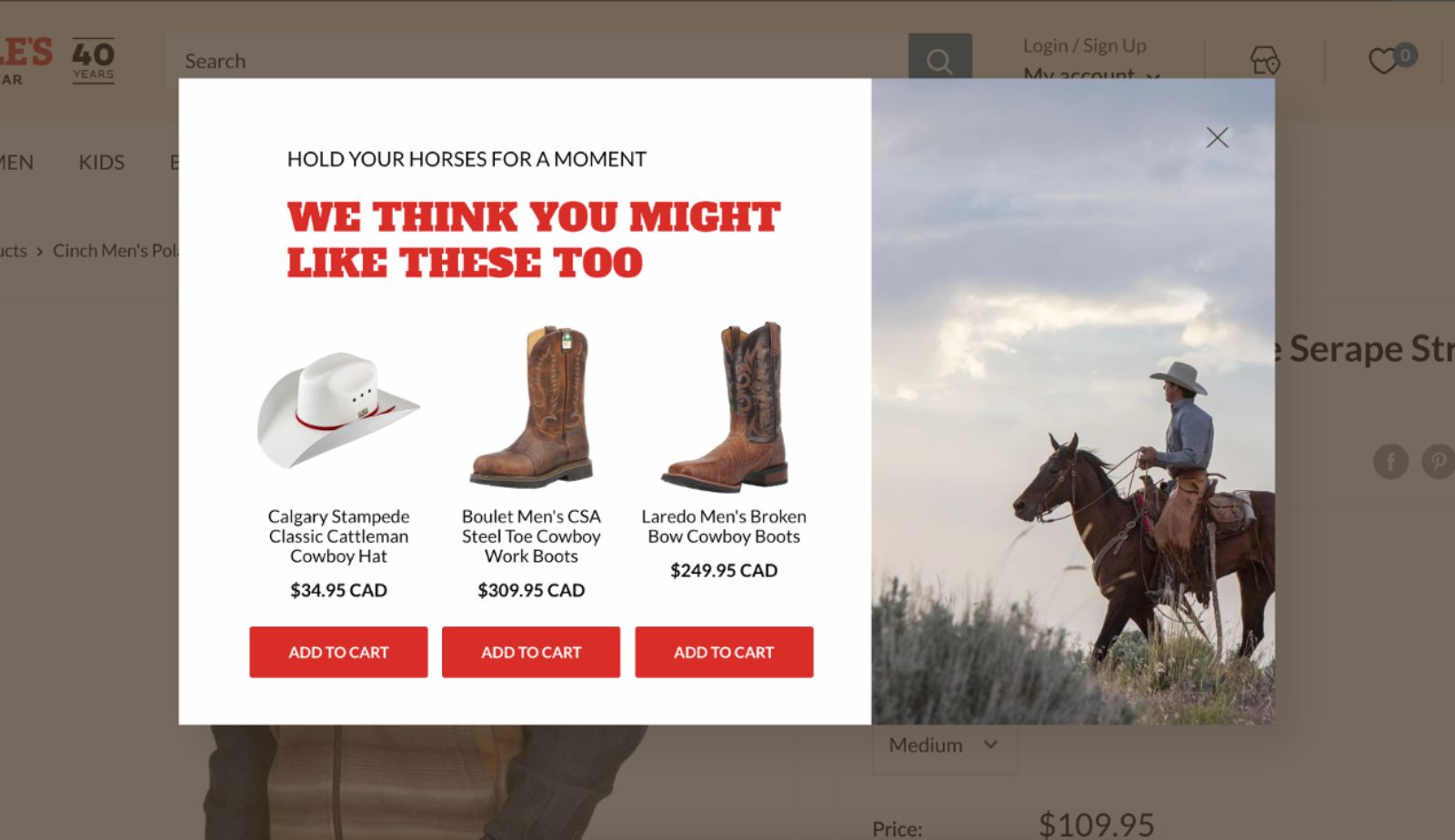
Lammle’s deployed exit popups that highlight their best-selling items. This tactical method motivates site visitors to continue shopping, maintaining their interest while they look through additional products. Through the strategic display of pertinent product suggestions via exit popups, Lammle’s saw a significant 23.5% boost in revenue generated from their product page traffic.
Blue Bottle Coffee’s Timed Email Collection
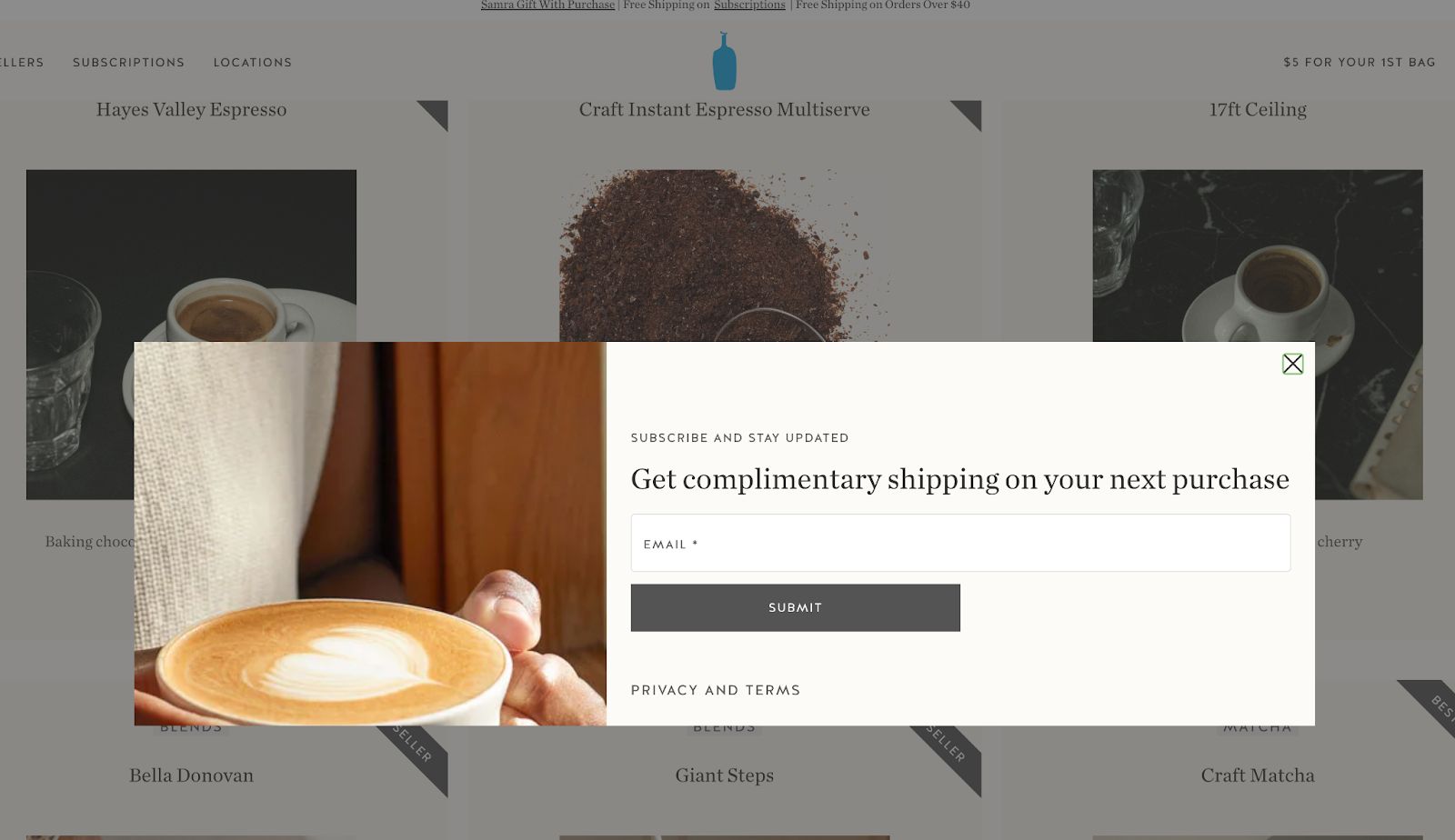
Blue Bottle Coffee – coffee retailer offering subscription plans, employs a straightforward time-triggered popup for email capture. The design and structure work well. The clean, refined aesthetic aligns perfectly with the brand’s overall website appearance. Looking more critically, both the incentive and the main message could be more persuasive. Much like meal delivery services, Blue Bottle Coffee probably enjoys high customer retention given that coffee tends to run out regularly in most households and workplaces (something we definitely understand). Starting with an irresistible promotional offer to attract new buyers, rather than simply promoting free shipping, might prove more effective.
Hiut Denim Co.’s Newsletter Signup
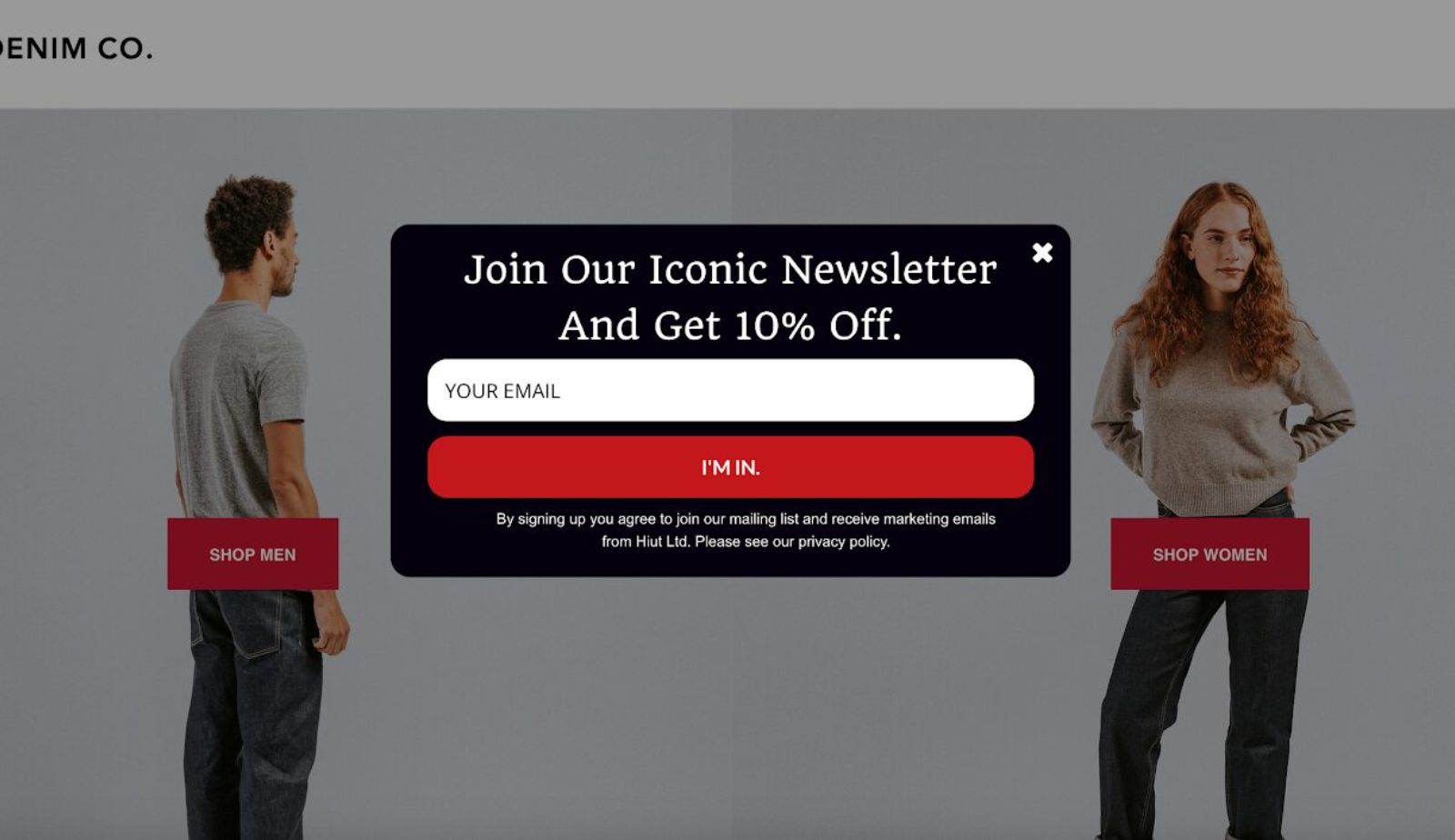
Fashion retailer Hiut Denim Co. employs a popup to build their email list by providing a 10% discount to those who subscribe to their “iconic newsletter.” While straightforward, this example works exceptionally well, particularly for online retail businesses. Notice the “I’m in” button, it’s far more engaging than a standard “Subscribe now” prompt.
Key Takeaways for Success
Before launching your popup campaign, remember these essential principles:
Timing Matters: Delay popup triggers by at least 20-50 seconds to reduce bounce rates and increase conversions. Instant popups feel pushy; timed popups feel considerate.
Mobile Optimization Is Non-Negotiable: Mobile-optimized popups recover 8-14% more abandoning shoppers compared to desktop-only versions. Ensure large tap targets, simplified forms, and fast load times.
Clarity Over Cleverness: Your headline should clearly state the benefit in 10 words or fewer. 80% of people only read the headline, so make it count with specific value propositions like “Save $25” rather than vague claims.
Always Provide an Easy Exit: Never obscure the close button. Frustrated visitors who feel trapped immediately abandon and never return. Make closing effortless—those who want your offer won’t need coercion.
Test Relentlessly: A/B test timing triggers, copy variations, and offer types. What works for one audience may not work for yours. Use data to refine your approach continuously.
Conclusion
Adding a popup strategically remain one of the highest-ROI tools in digital marketing. The examples showcased in this guide prove that success comes from choosing the right popup type for your goal and respecting your visitors’ time while providing genuine value.
The difference between an annoying popup and a converting popup boils down to three factors: timing, relevance, and value. Show the right offer, to the right person, at the right time, and you’ll see conversion rates that justify any initial resistance.
Start using popup apps with one popup type that aligns with your primary conversion goal. Test timing triggers, personalize your messaging based on visitor behavior, and continuously refine based on data. The businesses generating millions in additional revenue from popups aren’t using magic, they’re using the proven strategies you now have at your fingertips.

Hi, I’m Vu Cam Chi – a detail-driven digital marketer focused on building practical growth solutions for ecommerce and digital products. I combine data, user behavior, and clear messaging to turn ideas into results. Strategy guides my decisions, and optimization is part of my daily work. I care deeply about creating experiences that make sense for users and actually perform.