Popup Design Best Practices: How to Boost Conversions Without Annoying Your Visitors

You’ve seen them everywhere: popups that interrupt your browsing, block the content you’re trying to read, and make you frantically search for the tiny “X” button. But here’s the thing – when done right, popups are one of the most powerful conversion tools in your digital marketing arsenal.
The difference between an annoying popup and one that converts at 20%+ comes down to following proven popup design best practices. In this comprehensive guide, you’ll discover how to create popups that respect your visitors’ experience while dramatically increasing email signups, reducing cart abandonment, and driving more sales.
Whether you’re an ecommerce store owner, marketer, or web designer, understanding popup design best practices is essential for maximizing your website’s performance without sacrificing user experience. Let’s dive into the strategies that separate high-performing popups from those that send visitors running for the exit button.
Why Popup Design Matters
Before we explore specific tactics, it’s important to understand why popup design best practices are critical for your business. A poorly designed popup can increase your bounce rate by up to 5x, damage your SEO rankings, and frustrate potential customers. Conversely, a well-designed popup following best practices can generate conversion rates of 20% or higher.
The key is balancing conversion goals with user experience. Think of your popup like a helpful store assistant. If they jump in your face the second you walk through the door, you’ll likely leave. But if they wait until you’ve looked at a few items and then offer a relevant coupon or helpful advice, they become a valuable part of your shopping experience.
When to Show Your Popup
Don’t show popups too soon
One of the most important popup design best practices is timing. Research shows that displaying a popup within the first 5 seconds can increase your bounce rate by up to 5x. Your visitors need time to engage with your content and understand your value before being asked for their email or attention.
The optimal approach: Wait until users have engaged with your content for 10-50 seconds, typically appearing at 50% of the average time spent on the page. This timing ensures visitors have seen enough of your content to understand your value proposition before you make an ask.
Wait until the second page visit
Another effective popup design best practice is using page-delay triggers. When a visitor loads a second page on your site, they’re signaling genuine interest in your content or products. This approach can generate an impressive 28.98% conversion rate because you’re targeting people who are already engaged rather than interrupting first-time browsers.
Consider implementing a popup strategy that shows different messages based on page depth:
- First page visit: No popup or minimal banner
- Second page visit: Email capture offer with value proposition
- Third+ page visit: More aggressive offers or exit-intent popups
Use exit popups when they’re leaving
Exit-intent popups detect when a user’s cursor moves toward the browser’s close button or address bar, triggering a last-chance offer. This popup design best practice can reduce cart abandonment and increase engagement by 10-15%.
Exit-intent is particularly effective for:
- Ecommerce sites with shopping cart abandonment issues
- Service businesses where visitors research before committing
- Content sites offering lead magnets or newsletter signups
Pro tip: Make your exit-intent offer stronger than your standard popup. Since this is your last opportunity, consider offering a higher discount (15-20% versus 10%) or exclusive content.
Don’t show the same popup over and over
Nothing frustrates users more than seeing the same popup repeatedly. A critical popup design best practice is implementing frequency caps – limiting displays to once per session or once every 7-14 days for non-subscribers. This prevents “deal-seeking” behavior where users clear cookies just to get your discount again and reduces overall user frustration.
How to Design Your Popup
Where to place your popup on screen
Not all popup positions are created equal. Research consistently shows that centered and bottom-centered popups outperform corner or slide-in formats for capturing emails. Bottom-right placements can convert 11.32% less than centered ones.
Popup design best practices for positioning:
- Centered popups: Best for email capture and high-value offers, commanding full attention
- Bottom-centered: Effective for newsletter signups without being overly intrusive
- Slide-in (bottom corner): Good for low-commitment asks like social follows
- Top banner: Ideal for site-wide announcements that don’t block content
Full-Screen vs. Small Popups: Which to use
Understanding when to use different popup formats is a crucial popup design best practice. Full-screen “takeovers” work well for high-value top-of-funnel offers like Black Friday early access or exclusive product launches. However, they can reduce conversions by 18% when used mid-funnel on pages like shopping carts.
Use full-screen popups for:
- Major sales announcements
- First-time visitor welcome offers
- High-value lead magnet downloads
Use slide-in or centered modal popups for:
- Newsletter subscriptions
- Exit-intent offers
- Product recommendation popups
Make it easy to close
A visible “X” button or “No thanks” option is non-negotiable. Your popup design best practices should always include an obvious way to dismiss the popup. Additionally, ensure your popups are:
- Keyboard-navigable: Users should be able to tab through and close with ESC key
- Subtle animations: Keep transitions under 500ms to avoid disorientation
- High contrast: Text should be easily readable against backgrounds
- Screen reader compatible: Include proper ARIA labels
Keep it simple and clean
Modern popup design best practices favor clean, minimalist layouts. Maintain brand consistency with your colors and typography while using ample white space. Rounded shapes increase perceived authenticity and friendliness compared to sharp edges.
Design elements that convert:
- Clear headline (8-12 words maximum)
- Brief supporting text (2-3 sentences)
- Single, prominent call-to-action button
- Optional: Small, relevant image (but not on mobile)
- Always visible close button
What to Say in Your Popup
Use specific numbers, not vague promises
One of the most counterintuitive popup design best practices is that direct copy highlighting specific savings outperforms emotional language in 68% of tests. Instead of “Join our amazing community!” try “Save $20 on your first order.”
High-converting copy formulas:
- “Get [specific benefit] when you [action]”
- “Save [dollar amount/percentage] on [product category]”
- “Join [number] customers who [specific outcome]”
Make discount codes short and clear
Make your discount codes memorable and easy to use. Numeric codes like “SAVE10” or “WELCOME20” boost engagement by up to 20% compared to vague offers like “Save on your order.” This popup design best practice ensures customers can actually remember and use your offer.
Try two-step popups
Instead of immediately asking for an email address, consider using a two-step popup. First, ask a simple yes/no question: “Want to save 15% on your order?” This lowers cognitive load and can double signups while keeping bounce rates stable.
Two-step popup flow:
- Initial question or offer statement
- Click “Yes” or engage with offer
- Email capture form appears
- Deliver promised value
Add minimum spend requirements
Here’s a crucial popup design best practice for ecommerce: tie all discounts to minimum spend thresholds. A “Save $20 on orders over $100” offer protects your profit margins while increasing Average Order Value (AOV). Without minimums, you risk customers using discounts on already-discounted items or minimum purchases.
Show Different Popups to Different People
Target based on visitor type
Different visitors need different messages. Implementing segmented popups is an essential popup design best practice for maximizing conversions across your entire audience.
New visitors (0-1 page views):
- Focus on brand introduction and value proposition
- Offer moderate incentives (10% discount)
- Emphasize what makes you unique
- Example: “Welcome! Get 10% off your first order + free shipping”
Returning visitors (2-5 visits):
- Use exit-intent more aggressively
- Offer stronger incentives (15-20% discount)
- Create urgency to drive first purchase
- Example: “Still browsing? Here’s 20% off to help you decide!”
Repeat/VIP customers:
- Skip discount popups entirely
- Offer exclusive early access or loyalty rewards
- Focus on new product announcements
- Example: “VIP Early Access: Shop our new collection 24 hours early”
Match popups to the page they’re on
Generic homepage popups miss huge opportunities. A critical popup design best practice is customizing messages based on the specific page URL. Show “related product” popups on category pages rather than generic offers.
Category-specific popup examples:
- Women’s shoes page: “Get 15% off boots and booties”
- Electronics category: “Extended warranty available on all purchases today”
- Blog post about productivity: “Download our free productivity template”
Building trust with new visitors? Consider adding a sales popup that leverages social proof by showing real-time customer purchases to instill confidence in browsers.
Making Popups Work on Mobile Phones
Design for small screens
With mobile traffic often exceeding 60% of total visits, popup mobile optimization is perhaps the most critical popup design best practice. Your popup content must be legible without pinch-zooming, and buttons need to be “thumb-friendly” (minimum 44×44 pixels).
Mobile popup design best practices:
- Avoid edge-to-edge layouts (use margins)
- Increase font sizes (minimum 16px for body text)
- Make close buttons large and easy to tap
- Reduce form fields to absolute minimum (often just email)
- Test on actual mobile devices, not just browser emulators
Remove images on mobile
Here’s a game-changing popup design best practice for mobile: remove large hero images or videos from mobile popups. Images can reduce mobile revenue per visitor by 40%, while removing them can boost signups by 2-3x. Mobile users want speed and simplicity – give it to them.
Mobile vs. Desktop popup differences:
- Desktop: Can include imagery, multiple form fields, longer copy
- Mobile: Text-only or minimal graphics, single field, concise copy (under 30 words)
Avoid Google penalties
Google penalizes websites that use intrusive interstitials that block main content, especially on mobile. Following popup design best practices for SEO compliance is essential:
SEO-safe popup formats:
- Small banners that use a reasonable amount of screen space
- Slide-up popups from the bottom that don’t cover main content
- Age verification or legally required notices
- Exit-intent popups (not triggered by scroll)
Formats that risk penalties:
- Full-screen overlays that appear immediately on mobile
- Popups that block main content and are difficult to dismiss
- Standalone interstitials that must be dismissed before content access
Follow privacy laws
Always include a link to your privacy policy and clearly state how data will be used. This popup design best practice isn’t just about legal compliance – it builds trust with your audience.
Required elements:
- Clear data usage statement
- Link to privacy policy
- Easy opt-out mechanism
- Cookie consent (where required)
How to Measure and Improve Your Popups
Track these 6 key numbers
Successful implementation of popup design best practices requires tracking the right metrics. Monitor these six key performance indicators:
- Displays: How many times the popup showed
- Clicks: Engagement with your call-to-action
- Reach: Percentage of visitors who saw the popup
- CTR (Click-Through Rate): Clicks divided by displays
- Emails Captured: Successful conversions
- Attributed Revenue: Actual sales generated from popup subscribers
The last metric – attributed revenue – is the most important popup design best practice metric. A popup might have a 30% conversion rate but generate low-value subscribers who never purchase.
What to test first
Not all popup elements have equal impact. Focus your testing efforts on these high-impact variables:
Primary tests (highest impact):
- Timing: 10-second delay vs. 50-second delay vs. exit-intent
- Incentive type: Percentage discount vs. dollar amount vs. free shipping vs. free gift
- Incentive size: 10% vs. 15% vs. 20%
Secondary tests (moderate impact):
- Headline copy and value proposition
- Form fields: email only vs. name + email
- Position: centered vs. bottom-centered vs. slide-in
Tertiary tests (lower impact but worth testing):
- Button color and copy
- Images vs. no images
- Design style and layout
Make sure you have enough data
A critical popup design best practice for testing: ensure at least 500 interactions per variant before making decisions. Testing with too little data leads to false conclusions and poor decisions.
Statistical testing guidelines:
- Minimum 500 conversions per variant (not just views)
- Run tests for at least one full business cycle (7-14 days)
- Consider seasonal factors that might skew results
- Test one variable at a time for clear insights
FAQ
Average popup conversion rates range from 3-10%, but top-performing ecommerce campaigns can achieve over 20% click-through rates. The key is following popup design best practices around timing, targeting, and offering real value.
Implement a queue system to ensure only one popup shows at a time, prioritized by importance. Set frequency caps so the same visitor doesn’t see popups repeatedly, and always provide clear close options.
While intrusive popups can hurt rankings, well-timed, relevant popups that enhance user experience can improve time-on-site metrics, which are positive SEO signals. Follow Google’s guidelines to stay safe.
Yes, but with modifications. Mobile popups should be smaller, text-focused (minimal images), and easier to dismiss. Ensure they don’t violate Google’s intrusive interstitial guidelines.
Specific, quantified value performs best. “Save $20” or “15% off” outperforms vague offers. Test different incentive types (percentage off, dollar amount, free shipping, free gift) to see what resonates with your audience.
Wait at least 10 seconds, ideally 50% of the average time visitors spend on your page. For some sites, waiting until the second page view generates even better results.
Wrapping Up
Mastering popup design best practices isn’t about choosing between conversions and user experience but you have to balance both. By implementing the strategies in this guide, you can create popups that respect your visitors while significantly increasing email signups, reducing cart abandonment, and driving more sales.
Remember these key popup design best practices:
- Wait at least 10-50 seconds before displaying popups
- Use centered or bottom-centered positioning for email capture
- Provide specific, quantified value in your offers
- Segment audiences with different messages for new, returning, and VIP visitors
- Optimize aggressively for mobile with streamlined designs
- Track attributed revenue, not just conversion rates
- Test continuously, focusing on high-impact variables first
The difference between a popup that annoys and one that converts comes down to respect – respecting your visitor’s time, attention, and need for value. When you approach popup design with this mindset and follow proven best practices, you create a win-win situation where your business grows and your customers feel valued.
Ready to Get Started?
Start implementing these popup design best practices today and watch your conversion rates climb. Remember, the key is testing and optimization-what works for one business might not work for another, so use these guidelines as a starting point and refine based on your unique audience data.
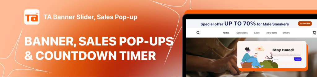
For even more powerful conversion tools, explore different popup apps like TA Banner Slider, Sales Pop Up for non-intrusive site-wide announcements, or implement a sales popup to leverage social proof through real-time purchase notifications.

Hi, I’m Vu Cam Chi – a detail-driven digital marketer focused on building practical growth solutions for ecommerce and digital products. I combine data, user behavior, and clear messaging to turn ideas into results. Strategy guides my decisions, and optimization is part of my daily work. I care deeply about creating experiences that make sense for users and actually perform.