High-Converting Email Popup Examples to Explode Your Subscriber List

Email popups have earned a reputation, both good and bad. Some marketers swear by them as list-building goldmines, while others worry they’ll annoy visitors and increase bounce rates. Here’s the truth: when designed strategically and triggered at the right moment, email popup examples prove that these tools can achieve conversion rates between 25% and 35%, far surpassing the industry average of 3.80% to 4.65%.
In this comprehensive guide, you’ll discover real-world email popup examples from top-performing brands, backed by hard data and actionable insights. Whether you’re running an e-commerce store, a B2B SaaS platform, or a content-driven website, you’ll find inspiration and strategies to transform your popups from annoying interruptions into welcome opportunities.
What Makes Email Popups Effective?
Before we explore specific email popup examples, it’s essential to understand what separates high-converting popups from those that visitors immediately dismiss. An email popup is a website signup form designed to capture visitor emails in exchange for value, typically discounts, exclusive content, or early access to products.
The most effective email popup examples share three core characteristics:
Clear Value Proposition: Top-performing popups immediately communicate what the visitor will receive. Vague promises like “stay updated” convert poorly compared to specific offers such as “Get 15% off your first order” or “Download our free buyer’s guide.”
Friction-Free Design: Single-field email forms convert at 5.77% on average, while four-field forms can still reach 4.60% if they include micro-commitments that build user investment. The key is matching form complexity to the value offered.
Strategic Timing: The best email popup examples don’t appear immediately when someone lands on your site. Instead, they trigger based on user behavior – scroll depth, time on page, or exit intent, ensuring the popup feels helpful rather than intrusive.
With these fundamentals in mind, let’s examine the email popup examples that are crushing it right now.
E-commerce Email Popup Examples That Convert
Nakie: Multi-Screen Education Flow
Nakie, a sustainable fashion brand, doesn’t just ask for emails – they educate visitors about their environmental mission across multiple screens before the signup request. This approach achieves an impressive 35% conversion rate by building emotional connection and brand alignment before making the ask.
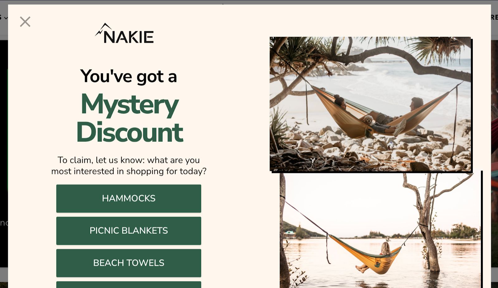
Key Takeaway: When your product serves a higher purpose or requires education, multi-step popups can increase engagement rather than create friction. Each screen builds value and commitment, making the final email request feel like a natural next step rather than an interruption.
Gaiam: Breaking Banner Blindness with Design
Gaiam’s petal-shaped popup immediately stands out among the countless rectangular boxes visitors encounter daily. This wellness brand aligned their popup design with their visual identity, creating something that feels like a natural extension of their brand experience rather than an intrusive marketing tool.
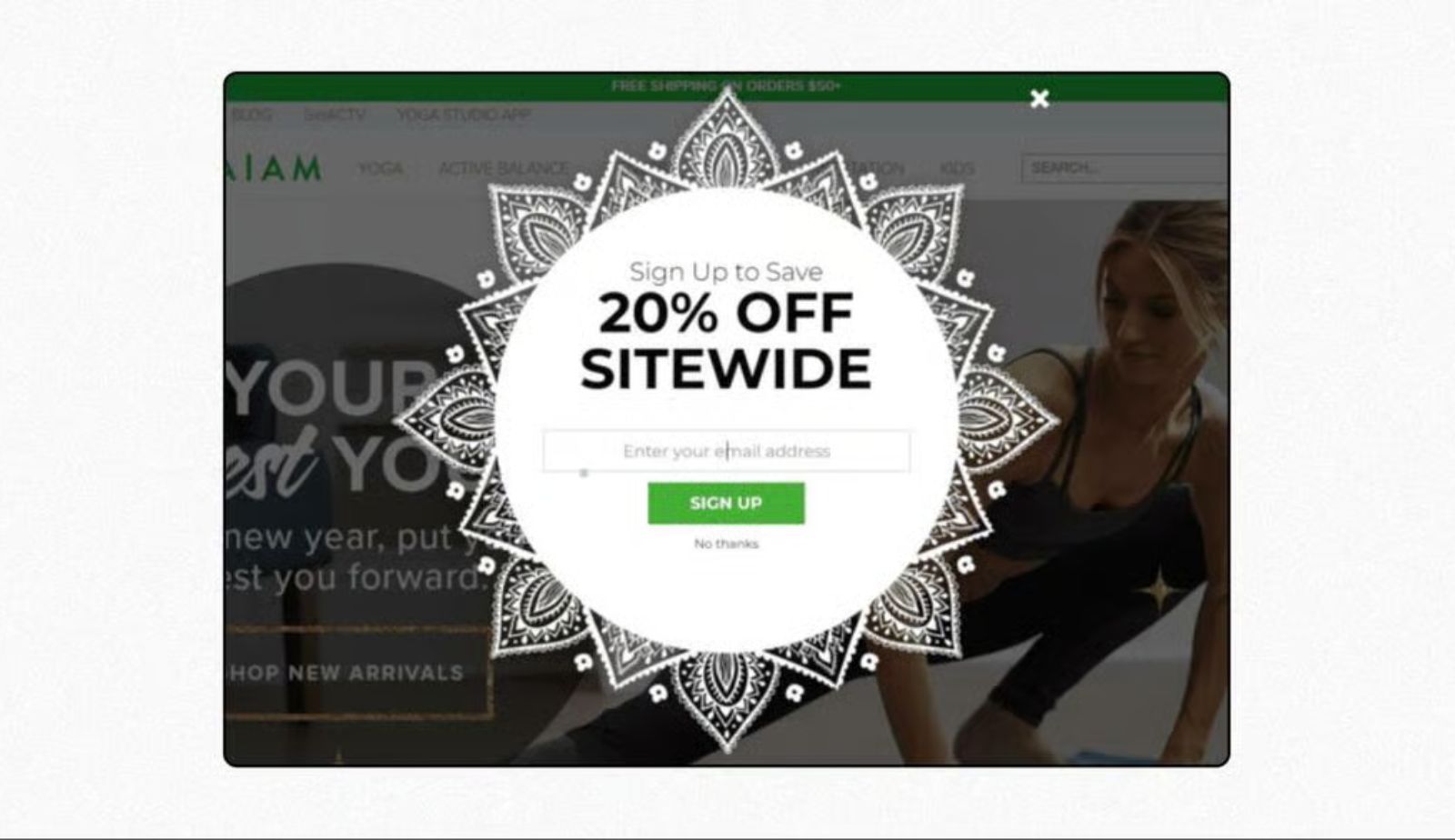
Key Takeaway: Your popup doesn’t need to look like everyone else’s. Custom shapes and brand-aligned designs can significantly reduce banner blindness, especially when the design reinforces your brand’s core values.
Essence Vault: Zero-Party Data Collection
Essence Vault uses gender-targeted popups to collect zero-party data – information customers voluntarily share. By asking about product preferences upfront, they segment their audience immediately, enabling more relevant follow-up campaigns and product recommendations.
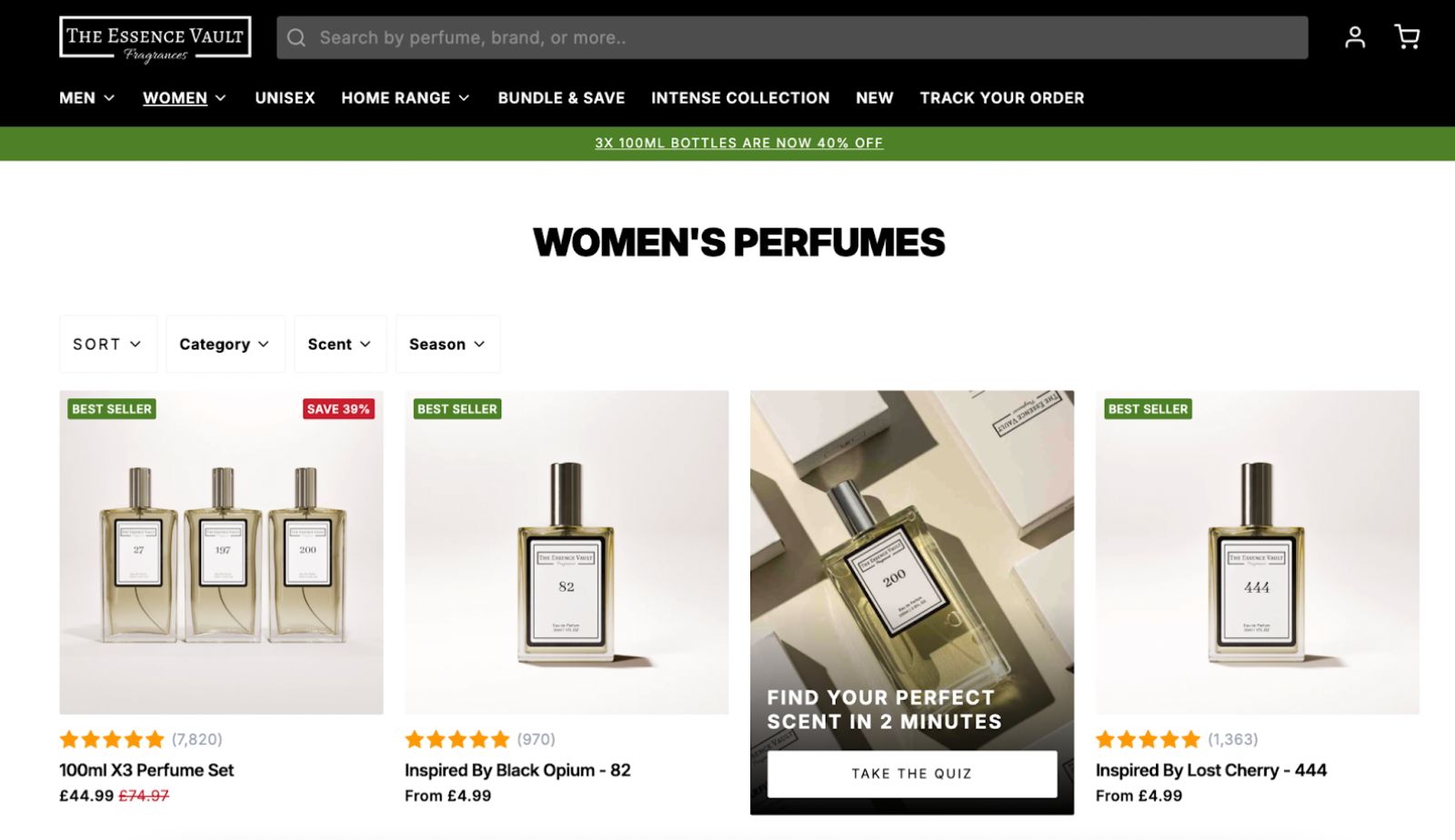
Key Takeaway: Email popup examples that collect more than just an email address can dramatically improve your email marketing ROI. When visitors self-segment, you can send hyper-relevant messages from day one, increasing engagement and reducing unsubscribes.
Gong.io: Leveraging Social Proof
Gong.io’s popup mentions that employees from companies like LinkedIn use their platform. This social proof technique addresses a key B2B concern – “Will this work for professionals like me?” before the visitor even needs to ask.
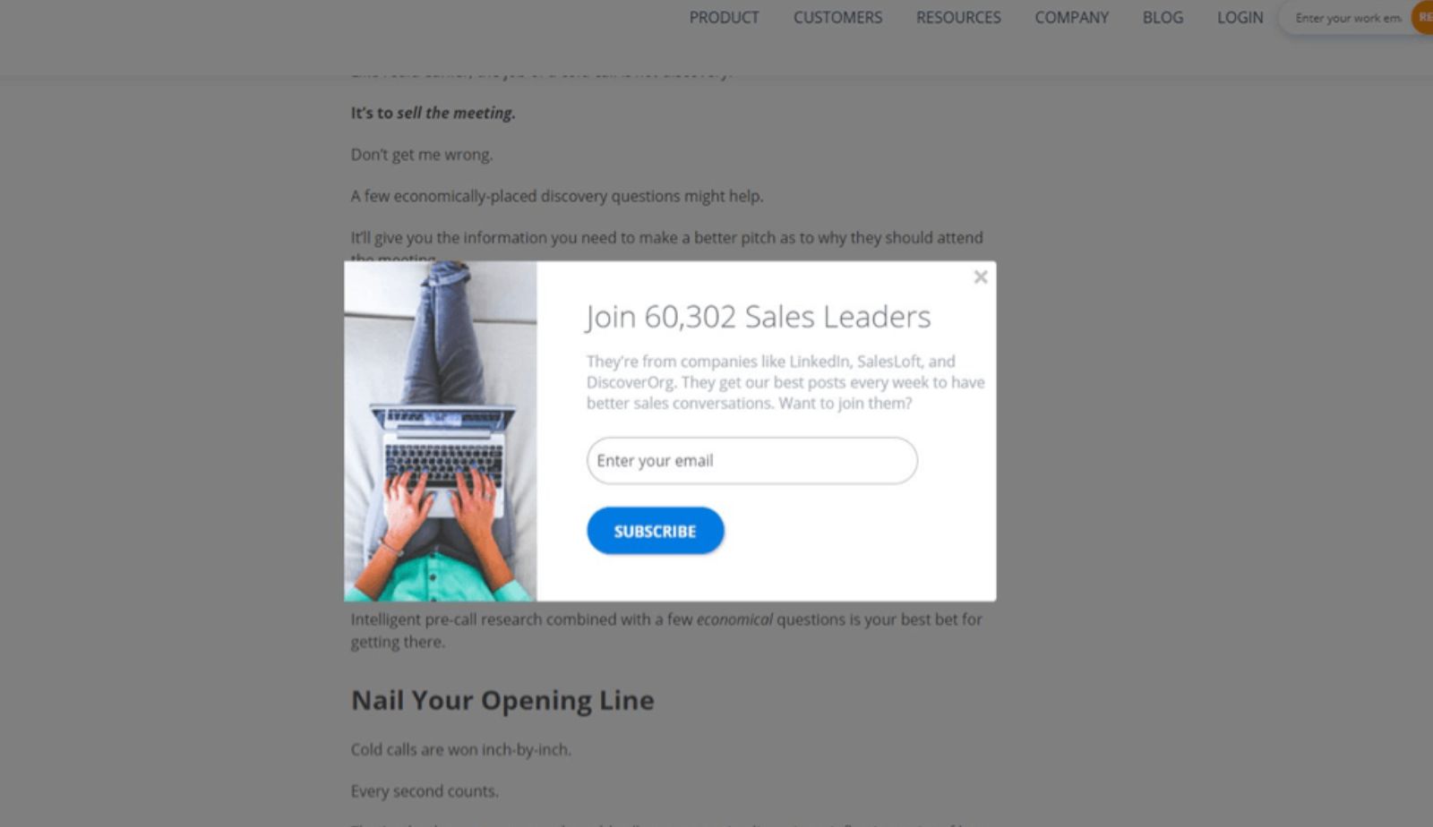
Key Takeaway: B2B buyers need credibility signals. Mentioning recognizable companies, specific job titles, or impressive statistics can overcome skepticism and position your popup as a gateway to proven solutions.
Sitepoint: High-Value Lead Magnets
Sitepoint offers free e-books in exchange for email addresses. These aren’t thin PDFs, they’re comprehensive resources that provide immediate, tangible value. This approach works particularly well for content-driven businesses and thought leadership brands.
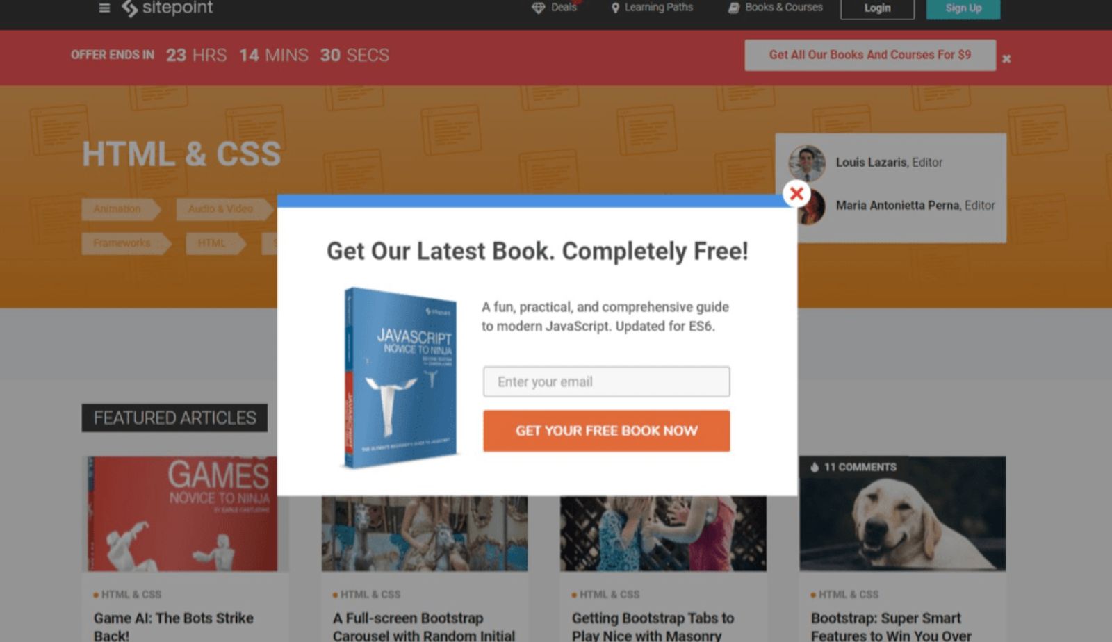
Key Takeaway: The quality of your lead magnet directly impacts both conversion rates and subscriber quality. Invest in creating genuinely useful resources, and you’ll attract engaged subscribers who are more likely to become customers.
Strategic Best Practices for Email Popup Design & Copy
Now that you’ve seen what works, let’s break down the specific design and copywriting principles that separate mediocre email popup examples from exceptional ones.
The Power of Numbers in Headlines
Quantified value copy outperforms emotional language in 68% of A/B tests. Compare these headlines:
Emotional: “Join our community of passionate learners”
Quantified: “Get 15% off your first order”
The second headline wins because it’s concrete and immediately valuable. If you’re offering a discount, state the exact percentage. If you’re providing content, specify what and how much. Specificity builds trust and clarity drives conversions.
Images and Visual Hierarchy That Drive Conversions
Email popup examples with relevant, attractive imagery convert at an average rate of 4.96%, compared to 3.80% for text-only popups. The image should reinforce your value proposition – product photography for discounts, lifestyle imagery for aspirational content, or human faces for trust-building.
Design Tip: Use high-contrast colors for your call-to-action button. It should be the most prominent element after your headline. Many successful email popup examples use orange, green, or red buttons against neutral backgrounds.
Friction Reduction Through Fewer Form Fields
Here’s where conventional wisdom meets nuanced reality. Single-field email forms convert best at 5.77% on average. However, four-field forms can still achieve 4.60% conversion if they incorporate micro-commitments – small steps that build psychological investment.
The key is value alignment. If you’re offering a 10% discount, one field is appropriate. If you’re providing a comprehensive buying guide, asking for name, email, company, and role is justified because the value matches the effort.
Tips for designing high-converting popups
The Role of Timing and Triggers in Visitor Engagement
Even the most beautifully designed email popup will fail if it appears at the wrong time. Strategic triggering is what separates annoying interruptions from welcome opportunities.
Last-Chance Conversions With Exit-Intent
Exit-intent popup technology detects when visitors are about to leave your site and displays a popup as a final conversion attempt. Top brands achieve 20-30% conversion rates with exit-intent email popup examples because they’re offering value to someone who has already decided to leave – making the popup feel less intrusive and more like a helpful suggestion.
Best Practice: Exit-intent popups should acknowledge the visitor’s intent. Phrases like “Before you go” or “Wait! Don’t miss out” perform well because they’re contextually appropriate.
Using Scroll Depth and Timing to Confirm Engagement
Displaying popups 20-50 seconds after arrival or after visitors scroll 50% down the page can reduce bounce rates by up to 45%. Why? Because you’re only asking for emails from people who have already demonstrated interest in your content.
The one-page delay trigger – showing the popup only after someone visits a second page – dominates with a 28.98% conversion rate. This approach ensures you’re targeting engaged visitors rather than someone who landed on your site by accident.
Don’t Show Popups to Existing Subscribers
One of the fastest ways to irritate your audience is showing email popups to people who are already subscribed. Implement subscriber suppression so your popup never appears to existing list members. This requires cookie tracking or account login detection, but it’s worth the technical effort for the user experience improvement.
How Mobile Optimization Drives Results
With over 60% of web traffic coming from mobile devices, your email popup examples must work flawlessly on smartphones. Here’s what that means in practice:
Thumb-Friendly Design
Use minimum 44×44 pixel buttons for tap targets. Anything smaller creates frustration and abandoned signups. Your close button should be equally large and positioned where thumbs naturally rest—typically the top-right corner.
SEO Compliance
Google penalizes “intrusive interstitials” on mobile , so full-screen popups that block content access. To stay compliant while still capturing emails, use smaller bars or popups that cover only 30-40% of the screen and include prominent close buttons. Many successful email popup examples on mobile use slide-up bars from the bottom or top rather than center overlays.
Simplified Mobile Layouts
Remove background images on mobile versions of your popups. They slow loading times and reduce readability. Focus on clean typography, clear value propositions, and single-column layouts that work within the constraints of small screens.
FAQ
Only if they’re intrusive interstitials on mobile landing pages. Smart triggering—delay, scroll depth, exit-intent—and properly sized popups prevent penalties. Desktop popups don’t face the same restrictions.
The one-page delay trigger leads with a 28.98% conversion rate, followed by exit-intent at 20-30% for top performers. Immediate popups have the lowest conversion rates because they interrupt before providing value.
Not if implemented correctly. Delayed triggers and clear close options keep bounce rates stable. The email popup examples that harm user experience are immediate, full-screen overlays without easy dismissal—avoid these.
The average hovers around 3.80-4.65%, but this varies significantly by industry and implementation quality. E-commerce popups with discounts typically perform better (5-10%) than B2B content offers (2-5%). The email popup examples featured in this guide achieve 15-35% by combining multiple best practices.
Conclusion
The email popup examples throughout this guide prove one fundamental truth: when designed strategically, timed intelligently, and aligned with genuine value, popups transform from annoying interruptions into powerful list-building engines.
Start by auditing your current popup against these best practices. Is your headline specific and value-focused? Does your popup trigger at the right moment? Are you making it easy to close? Small refinements in these areas can double or triple your conversion rate.
Your next steps are straightforward. Choose one email popup example from this guide that aligns with your business model. Implement it with your unique value proposition. Test, measure, and refine. The brands achieving 25-35% conversion rates didn’t start there, they iterated their way to excellence.

Hi, I’m Vu Cam Chi – a detail-driven digital marketer focused on building practical growth solutions for ecommerce and digital products. I combine data, user behavior, and clear messaging to turn ideas into results. Strategy guides my decisions, and optimization is part of my daily work. I care deeply about creating experiences that make sense for users and actually perform.